Tuesday 15 December 2015
Double page spread 1
Friday 11 December 2015
Friday 20 November 2015
Front Cover and Double Page Spread Evaluation
Front Cover and
Double Page Spread Evaluation
The magazine I have made is
a 1960’s theme as it is my favorite decade of music and one the changed history
forever. I have made all the details on my magazine exact like it would be an
actual magazine from the 1960’s.
My main target audience for
my magazine is people who enjoy the 1960’s but there are still people who could
be interested in all types of music or who like to learn about the 1960’s. And
I believe my codes and conventions does appeal to the target audience
satisfaction as it matches the colors and you feel your reading an actual
magazine from the 1960’s. I believe this magazine would appeal to my target
audience from the type of details I have put into my magazine the makes it more
1960’s style.
For my front cover I had to
try really hard had to search for the codes and conventions, so I searched up
former 1960’s magazines and had to go all over the internet on to websites to
check to find the certain details perfect for my magazine cover. I as well used
a questionnaire to find out what people who have thought of the magazine and
what should go into the magazine and what would fit into my magazine. I used
around 30 people, (13 adults with 17 teenagers and 16 males with 14 females).
From the questionnaire I found out what the magazine should be named, which got
me `Back to the Past` which is the biggest part of the magazine as it is one f
the main focuses of the magazine, what font I used which helps along with the
magazine name, the graphic feature which attracts the reader more, and it was a
heart which resembles the type of movement what was happening in the 60’s which
is love, and one of the most important details which is what camera shot I
should use, which most people voted for a wide shot. I as well used social
media which goes against the Hypodermic Needle Model because of how I interact
with the audience.
Like I was saying before I
used many things to help me get the design of my front cover and double page
spread so I analyzed two different types of magazines `NME` and `Rolling stone
magazine` which both had something to do with 1960’s music, as the NME magazine
had talked about John Lennon and as well had him on the front cover and the
Rolling stone magazine is very popular with 1960’s music. When I analyzed the
magazines it had helped me get the codes and conventions for my 1960’s magazine
and helped me get a few ideas for the types of style I might want my magazine. And
as well as the main image of the NME magazine as it helped me choose the colors
of my main image. And the Rolling Stone magazine helped me choose my design of
my magazine.
My magazine represents the
people who had published it as a type of company who wanted either people to
remember the 1960’s who wanted to go pack to ‘the good all days’ or they want
people who weren’t alive at the time to get a feel to it to see how it was with
the different types of magazine or to see how music was in the 1960’s and what
people think about the music back in the 1960’s. And my magazine front cover
main image make get represented from my main image like he is a famous 1960’s
star who had a good sense of fashion but also loves to be a musician.
Talking about my main
image, my star in this is a representation of John Lennon in 1966 holding a
guitar in a certain type of suit with sunglasses on, so I used somebody and dressed
him as close as I could get to him, and as well made him stand in the same position
as he was in the image and do the same pose he had done in the John Lennon
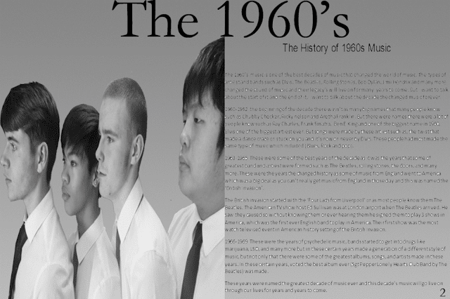
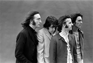
photo. And for my Double page spread I used and image of The Beatles all lined
up next to each other and all in suits, so I used four of my classmates and got
them all in a line and had made their color of the image and lighting exactly
how it was in the image which was grey with a kind of dark lighting to it.
When I started with my
draft and into the final placement I had only made a few improvement on my
front cover which were, the website at the bottom and having a Facebook and twitter
on the which made the magazine more realistic like it was a real company, the
bar code making it seem like its actually in stores, and the bands at the bottom
left letting the know what’s in the magazine. And only one thing I changed in
the double page spread was how I put a number at the bottom of the page and as
well as a side heading to it.
In conclusion I have used
many types of research such as a questionnaire, or look on the internet to
search for types of codes and conventions for my specific 1960’s music
magazine. And from this researched I have made the magazine front cover and my
double page spread as best I can and how I would have liked it to be formed.
And I do believe my magazine accomplishes my target audience’s expeditions of a
1960’s music and I as well accomplished my codes and conventions of a 1960’s
music magazine.
Tuesday 10 November 2015
Market Reseach Focus Group for my Double Page Spread
Me: First do you overall like my double page Spread?
Boj: Yes it looks very professional
Owen: Yes it fits in well with the genre of you magazine.
Me: What are the best Features?
Boj: The main image grabs the attention of the target audience
Owen: The central image is definitely the best feature as it is really eye catching
Me: What can I do to improve my double page spread?
Boj: Add a number to the bottom right hand corner to fulfil the codes and conventions of a real magazine
Owen: Firstly take all of the white out of the text and secondly bring Marcus closer in to the 3 others on your central image.
Me: Would you say this double page spread could be in a magazine?
Boj: maybe, if you do what I suggested above
Owen: No not really, it needs a bit of work, but it is very close to looking legit.
Me: Does my colours fit the theme of my magazine?
Boj: Yes, I can see the black and white fits with the theme of 1960s
Owen: Yes because 60s rock is old and the colours black and white represent the olden days.
Me: Could you compare this to a real magazine double page spread?
Boj: Not really, but it looks good none the less. maybe add/ change the font of the heading perhaps
Owen: No it isn't to that standard just yet as there are a lot of flaws, however with a bit more work then maybe I could.
Me: Does the picture on my double page spread match the theme of my double page spread?
Boj: Yes, the codes and conventions of a Beatles magazine is all there
Owen: Yes it looks great
Me: Does the title match the theme of the magazine?
Boj: No, I think the font could be changed to be more authentic/ old
Owen: Yes I believe it does as it mentions the 1960s however the font could be improved.
Me: What would you add or remove from my double page spread?
Boj: Add another image maybe, or again change the font
Owen: Remove the white parts in the text and add a page number
Me: Out of 10 what would rate my double page spread?
Boj: 7
Owen: 7
Friday 6 November 2015
Double Page Spread Review
Double Page Spread Review
In my double page spread draft, you can see it’s a picture of
the Beatles from the internet making it not and original picture, so I changed
it using 4 different people (Owen, Boj, Danny, and Marcus) and making them
stand in the same position as they Beatles were in the Double Page Spread draft.
I also used the same colour on the picture, meaning in the Double Page Spread
draft photo the picture of The Beatles is in black and white so I made it in my
own to make it black and white in my Double Page Spread, and as well on the Double
Page Spread draft I used the same type of lightning on The Beatles image on to
my image which has little light but still enough light.
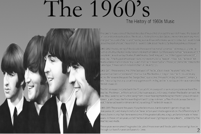
Double Page Spread Draft 1
This is my Double Page Spread that I have made this a 60's genre magazine. I have used the biggest band in the 60's which of course is the Beatles as my draft for my Double Page spread, and will replace the image with an image I used with other students who had modelled a similar stance of the image on this Double Page Spread for my real Double page spread. I as well had the black and white colors for the representation of the colored TV's in the early 60's which most people remember the 60's of.
Double Page Spread Analysis
This is the analysis of a double page spread about the 60's. I made this to show the features the double page spread have, and as well to give me and idea about a 60's double page spread which is the type of genre i'm using for my magazine.
Friday 2 October 2015
Camera Shots
Camera Shots
Extreme wide shot:
The view is so far from the subject that he isn't even
visible. Often used as an establishing shot
Very wide shot:
The subject is visible (barely), but the emphasis is still
on placing him in his environment.
Wide Shot:
The subject takes up the full frame, or at least as much as
comfortably possible.
Mid shot:
Shows some part of the subject
in more detail while still giving an impression of the whole subject.
Medium Close Up:
Half way between a MS
and a CU.
Subscribe to:
Posts (Atom)


